Differing points to view
Have you thought about how you are now using the internet compared to probably even 2 short years ago?
In 2010 it would have been that you looked at websites on your computer and maybe had email on your phone. Now we have pads and phones, smart TVs, even cars with internet connections.
As a result of these differing ways to view the internet, in the middle of last year we began working on 'responsive' designs for websites. These two buzz words basically mean that your website is designed in such a way that it resizes/relays out its design to best suit the device it is working on.
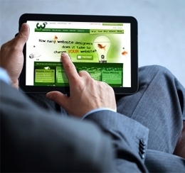
The growth of mobile and pad based browsing has increased exponentially. You only have to look at your own company or house hold to see how things have changed.
Mobile devices make it easier and faster to get to a website than opening your laptop, turning it on, logging in etc. Mostly it is two buttons and bang! You are where you want to be finding information.
This migration of use is not going to stop people using desktops and laptops, but it does mean you have to consider the mobile user when you add information to your site.
If you have an older site your system will work on pads and mobile phones. On pads the page will work fine, but on mobile phones it will not auto relayout to suit the small size. We are able to convert your site to be mobile friendly, so if you want to talk about this, please give us a call.
An important thing to remember with all the 'hype' about the use of the mobile internet is that, there has not been an increase in the numbers of people using the internet, it is a change in the way they are using it and in some cases how much they are using it. If your website is to succeed you need to deliver the right message to your customers in the right way.
Back...